![](https://cdn.myportfolio.com/b65df0166e2df860613e421700ebc66f/ecf13ac5-0da9-457a-bffb-6f124c1bc119_rw_1200.jpg?h=3d9e1f5eff985045695cb037d1c1e873)
![](https://cdn.myportfolio.com/b65df0166e2df860613e421700ebc66f/27951291-72e1-43f0-b2eb-dd9929e9f6f2_rw_1920.png?h=6553c0c277bd2d2fd1ce923bd339bf4b)
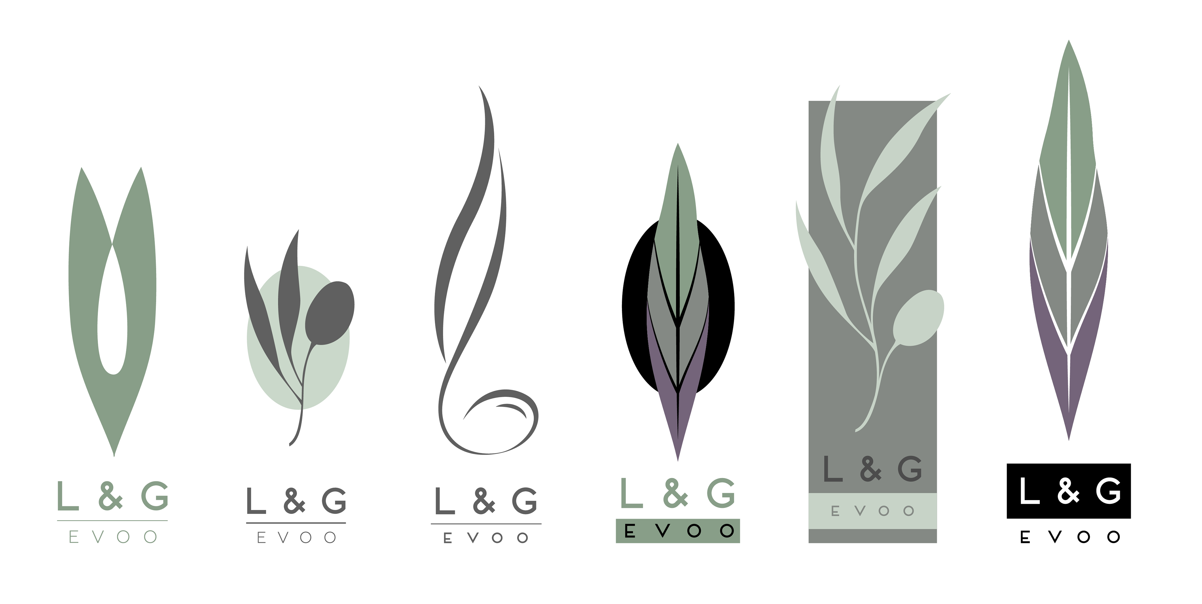
Several versions of the logo during the refining process can be seen below. A symbol for family and/or home was incorporated originally but later removed in favor of a more organic design.
![](https://cdn.myportfolio.com/b65df0166e2df860613e421700ebc66f/9066a068-501c-4b3d-b9f1-0c3e494101ca_rw_1920.png?h=3c494a8e25701aab02f55a436a08c07e)
![](https://cdn.myportfolio.com/b65df0166e2df860613e421700ebc66f/d70d3f99-2d7a-459b-9a8d-730ecd911072_rw_3840.png?h=ead8f42317165eb69c97061af9c6fdbf)
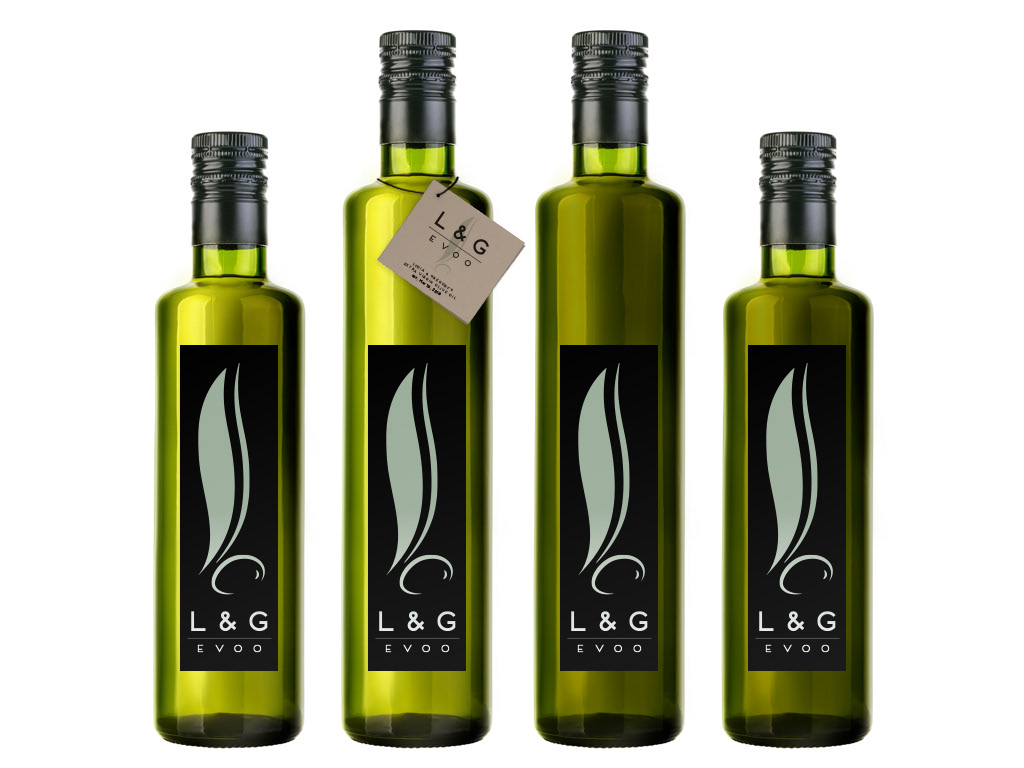
Logo and packaging design for a family owned olive oil brand. My client was looking for a symbolic, clean design focused around olive trees - the leaf, in particular. We focused on the shape and especially the colors they would see looking out into their family's olive grove.